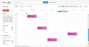
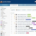
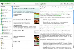
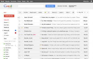
 Google’s social initiative google+, gave the opportunity to change their main web applications (search, gmail, calendar, google +) UI considering the new trends. Even though they are still experimenting they seem to be on the right track. They are combining cleanness, simplicity and flexibility. Google say their design principles are based on focus, elasticity and effortlessness. I will try to look into what makes a good UI for vertical web applications, by exploring these UI trends.
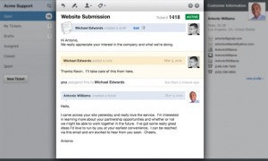
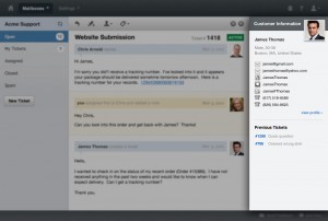
There seems to be an effort to make things cleaner and smoother with use of light grey and white colour variations for borders, backgrounds, icons or even text fonts. The visitors get the effect that “this looks more like an applications rather than a website…”. White spaces or padding is used to distinguish different sections, providing better focus to the different tools or features of the web apps. A good example of this UI practice can be seen on on helpscout an innovative email support app.
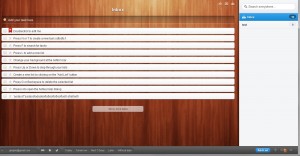
Because of the nature of focus web applications, simplicity is a key factor for success. A successful web app must combine simple and effortless interaction with increased results and productivity. To achieve that web apps ask for minimum effort on input from the user. For example todo application wunderlist asks the user to simply white on a textbox and press enter. The app automatically saves the task… (no need to click on new task, enter the details, and then click on save). The flow is very natural, simply type and enter. When the task is completed the user clicks on the checkbox on the list item to mark as done … (no need to click on the task to open, set status to completed, and the click save).
To achieve this natural flow wunderlist and other web apps rely on the simplicity of JSON and the power of AJAX. With minimum data transfer to the server (JSON usage) the application manages to perform transactions without having to reload the page (AJAX) making the whole process very fast. As a final touch they wunderlist has added a nice sliding effect to make the whole process seem more natural.
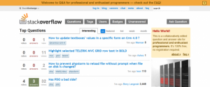
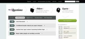
Since we are talking about vertical web applications, I cannot but comment on the use of vertical lists instead of complex tables. Again in the spirit of simplocity is best, many web apps use simple vertical lists to display queries to their users. Good examples of this practice can be seen on stack exchange and wpquestions.
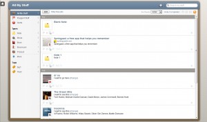
Web apps UI are also influenced by the touch revolution that the iPhone started. Even though some web apps have matching native applications for mobile devices, there seems to be an effort to deliver applications on the bowser that are touch friendly. helpscout and springpad are classic examples of this practice.
When combined, these key UI principles can provide the basis of a great web application. You can see below more examples of good web app design.
Sources:
https://www.google.com/calendar/render
